
Visual Identity Development
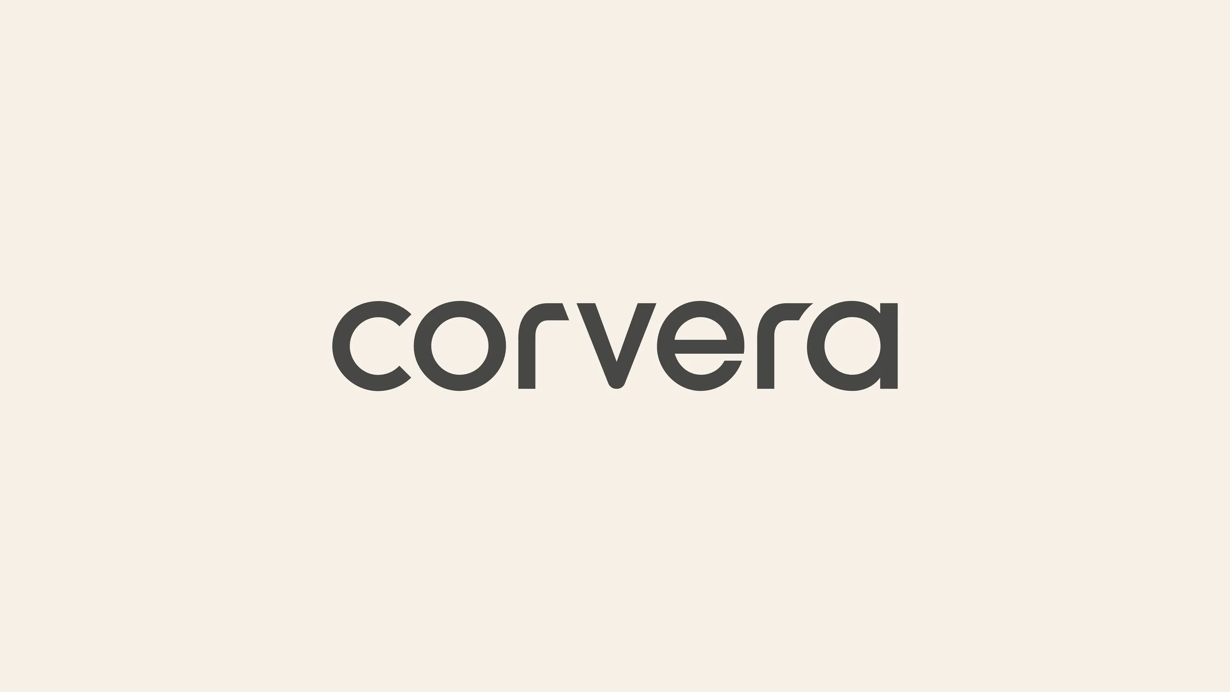
Corvera
A collaboration with 17 days, an award-winning
brand consultancy agency.
Calm to cut through the chaos. Bringing soul to SAAS.
Context
Corvera delivers AI supply chain management for fast growing brands, with a mission to help founders cut wastage, improve margins, and maximise revenue.
The AI SAAS marketplace is growing rapidly so differentiation is vital if a new player like Corvera is going to grab attention, drive trial and secure subscription. Corvera’s founders, Chris Kong and Dirk Breeuwer, invited 17days to define the brand’s visual identity ahead of launch.


The Story.
We began by exploring how the founders want users to feel when they use Corvera.
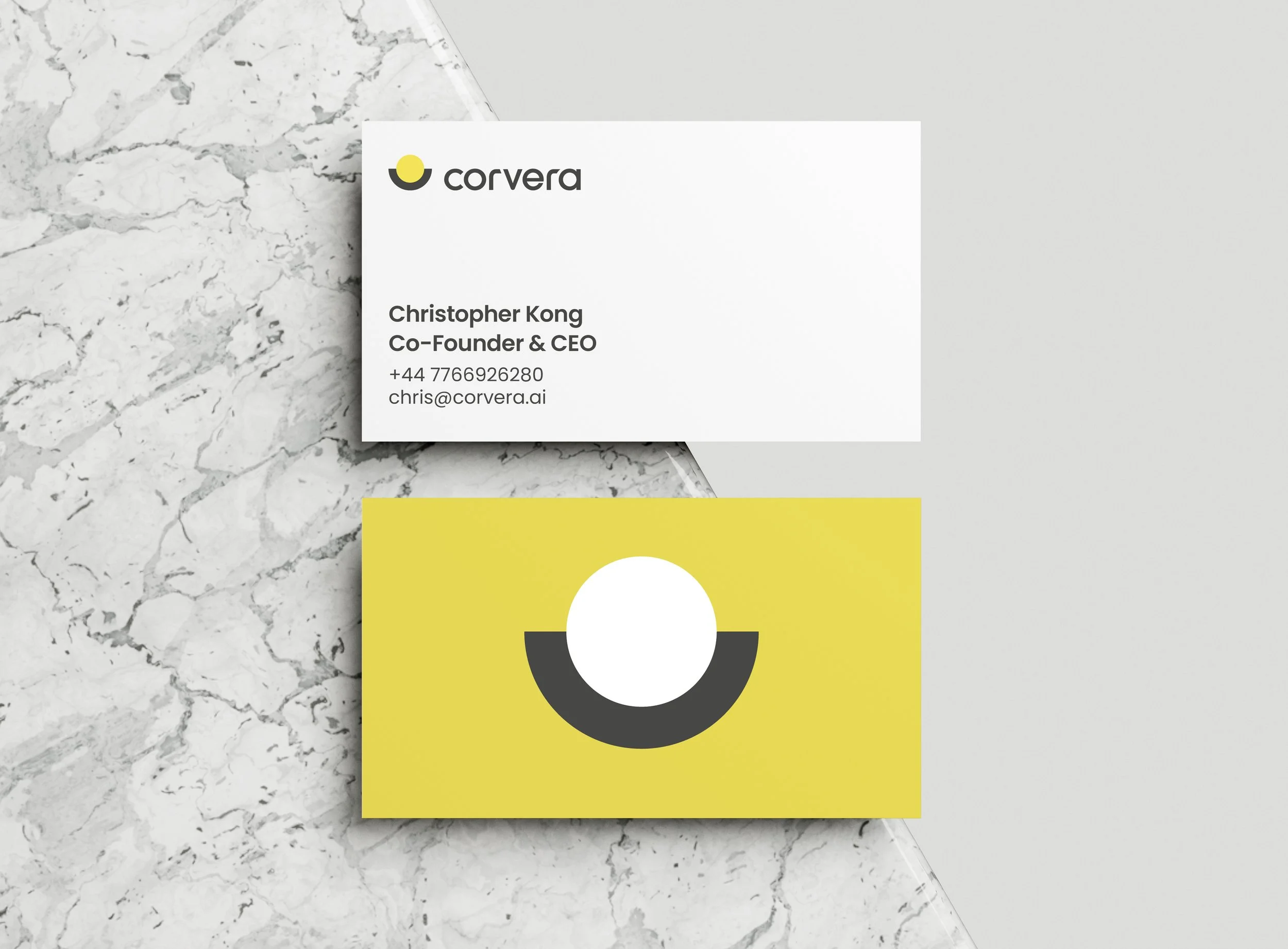
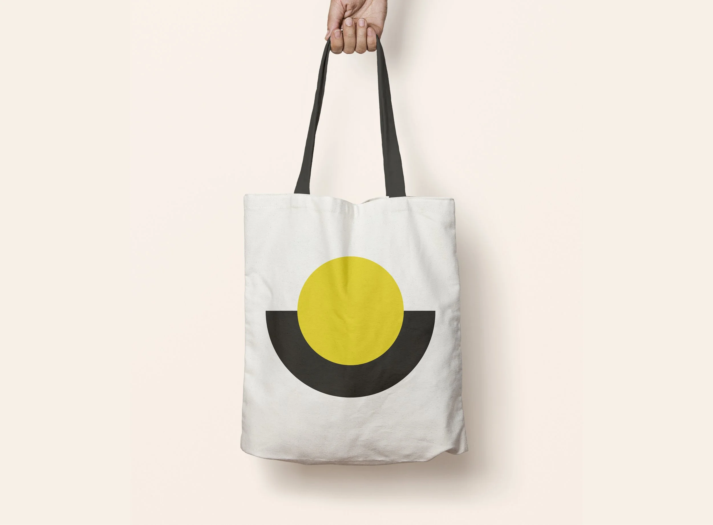
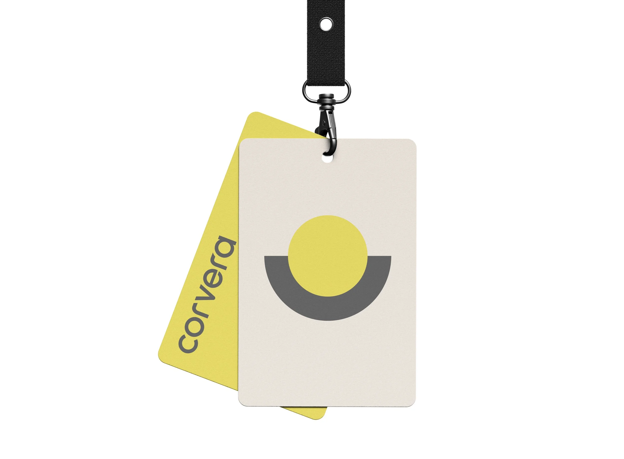
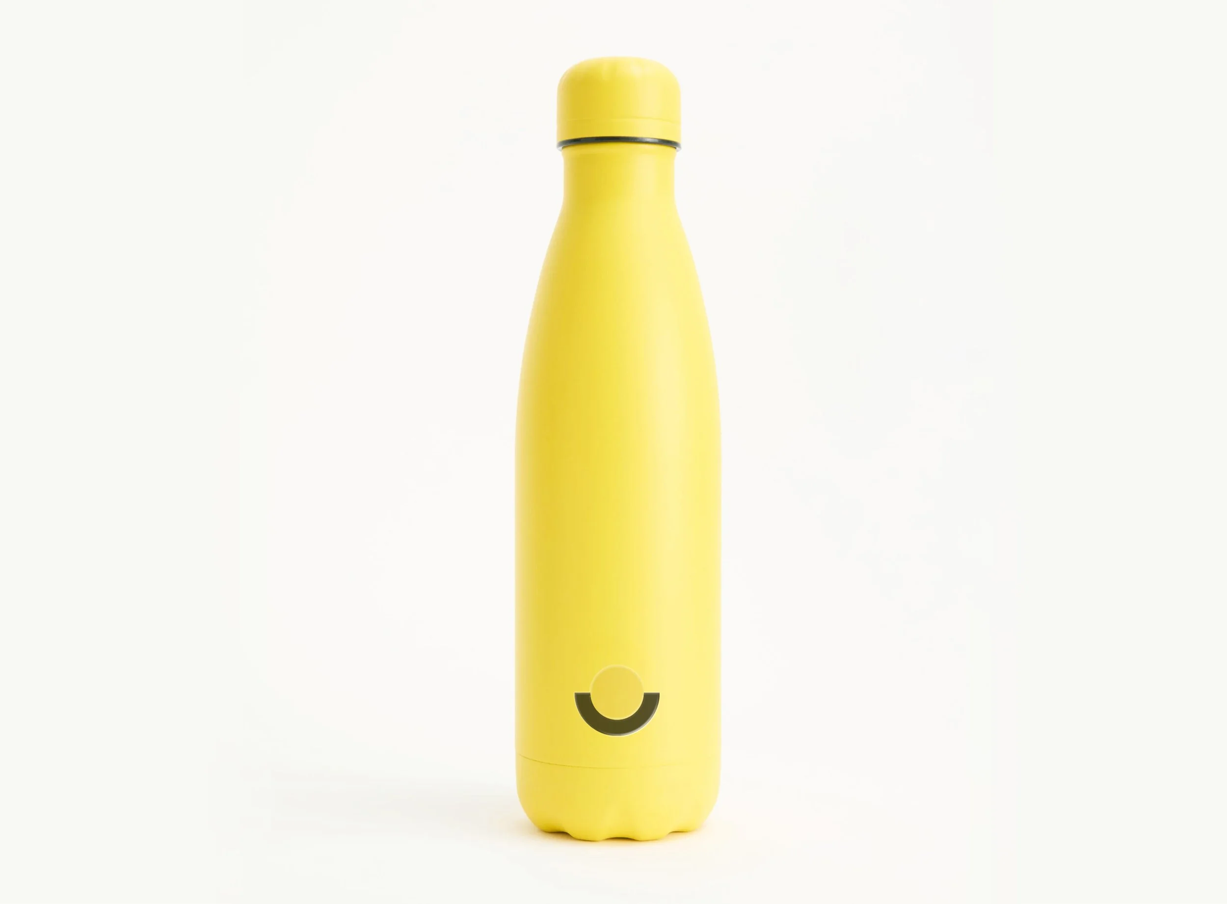
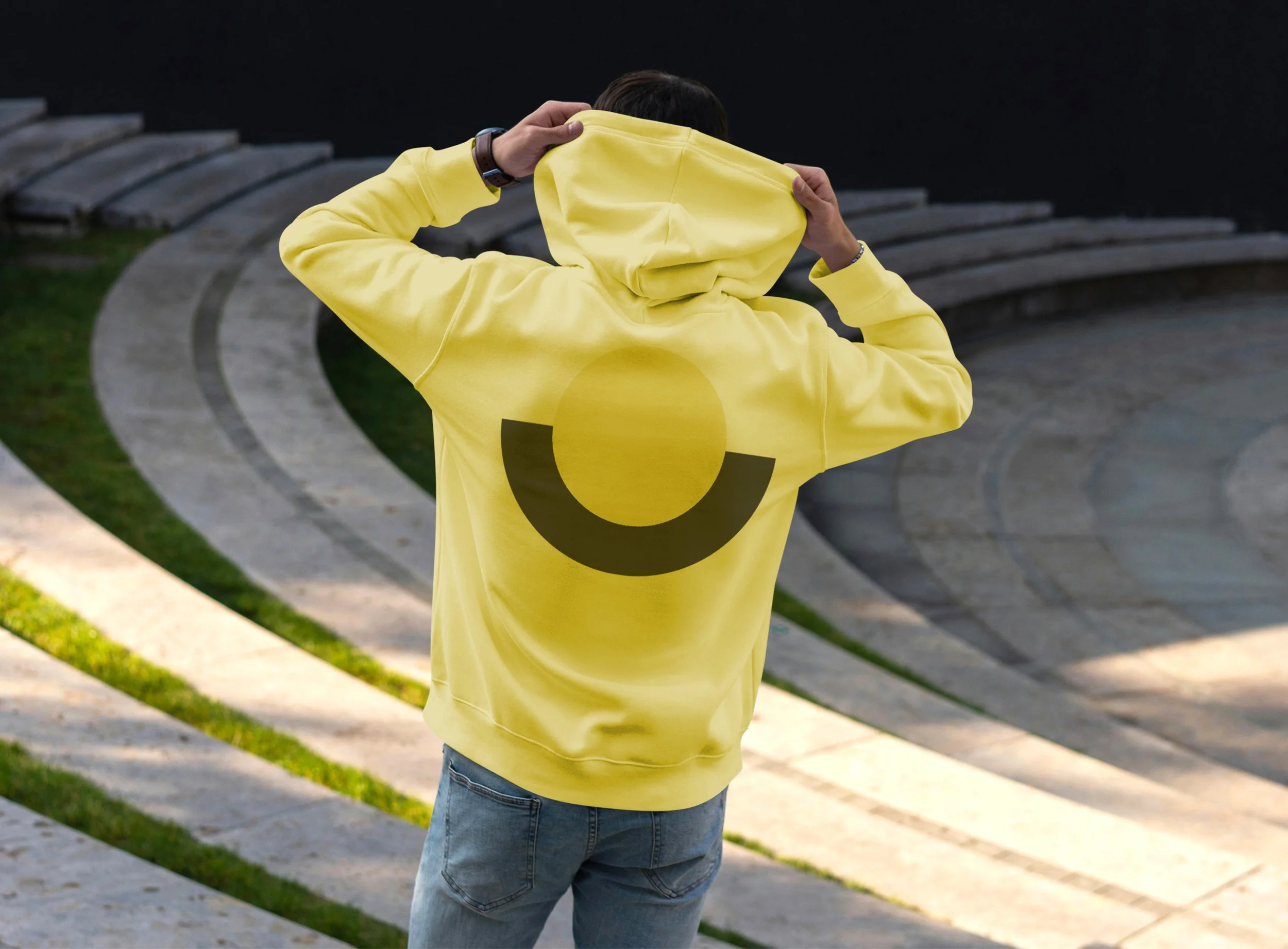
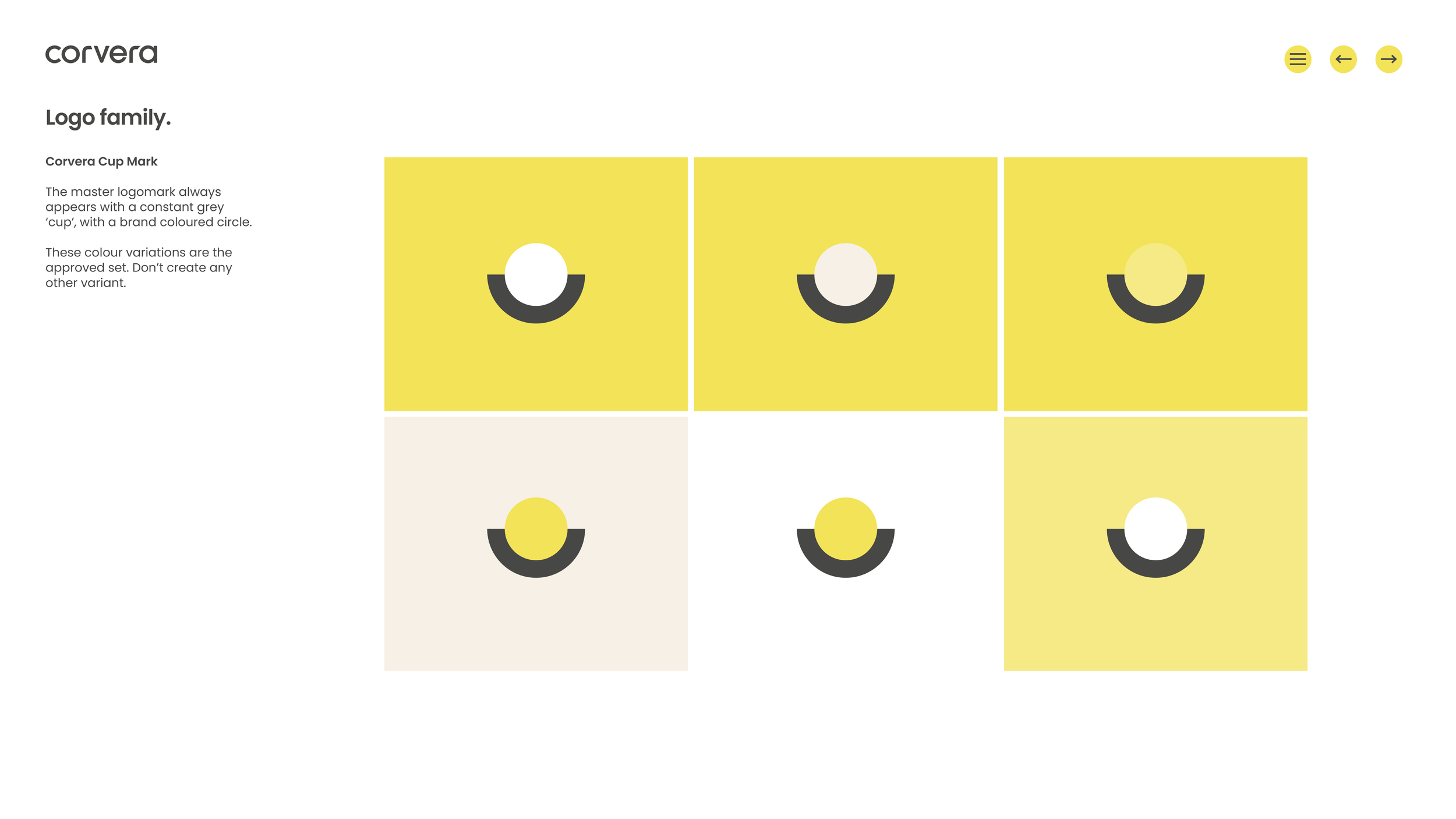
Of course, the platform’s features and functionality are central to its value, but to differentiate the brand we wanted to focus on emotion, not function. Design experimentation led us to the four emotional pillars of support, optimism, clarity and Zen-like calm. From here the visual identity evolved, using colour, shape and letterform to create an elegant and contemporary logomark and branding toolkit that is easy to roll out across all digital and physical channels.
A calm and confident platform experience. (by Beehiiv)
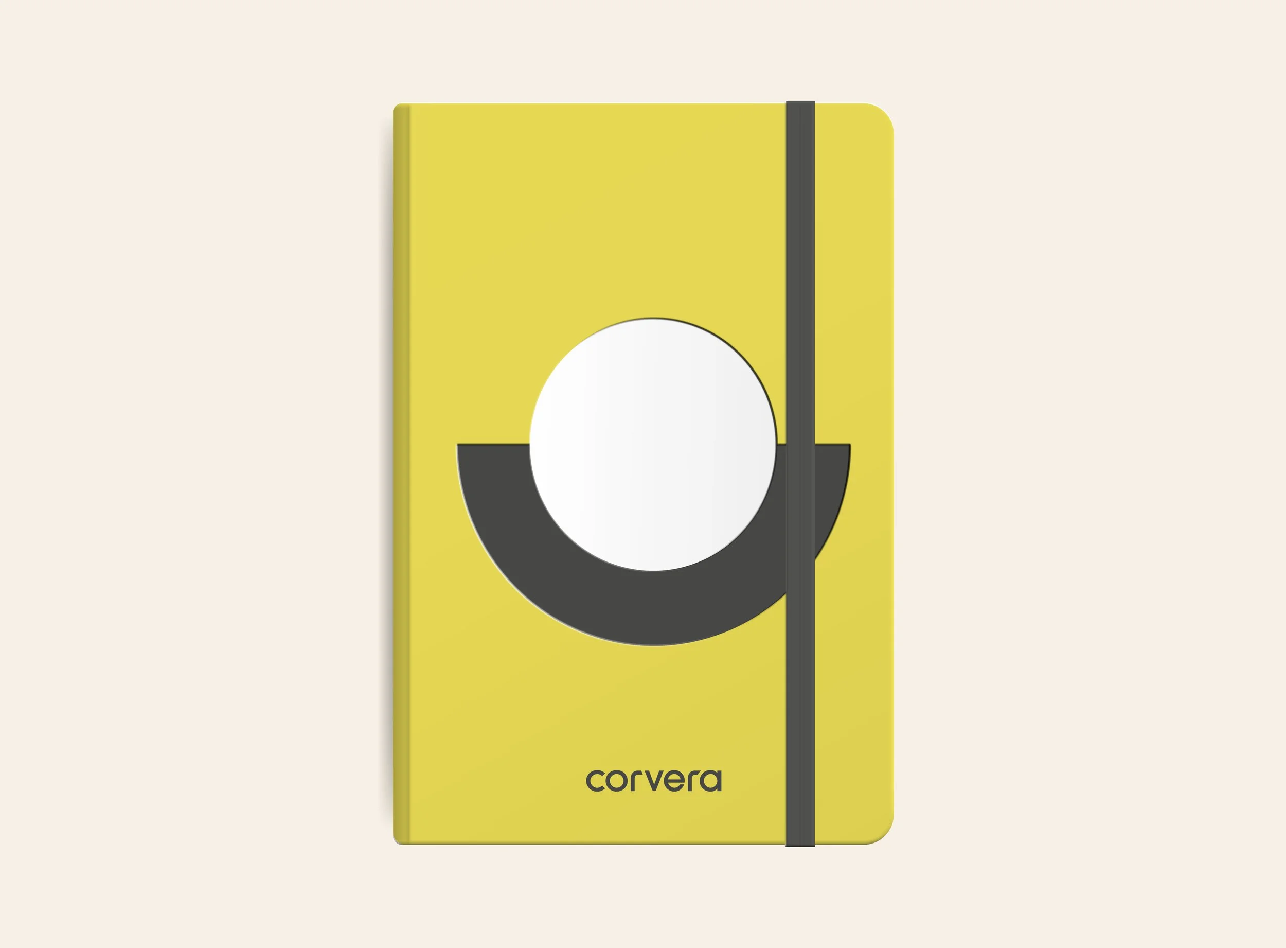
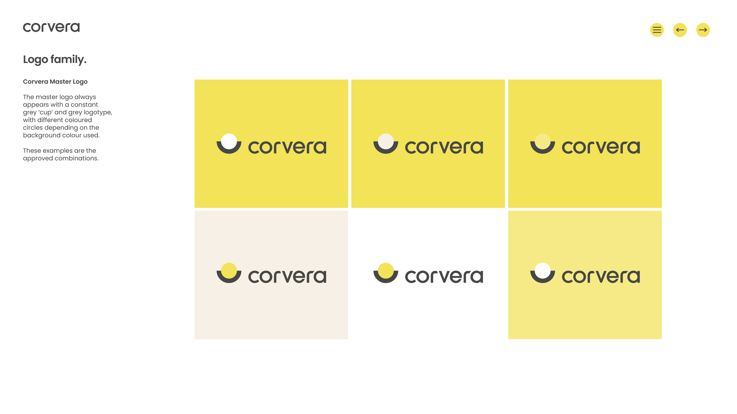
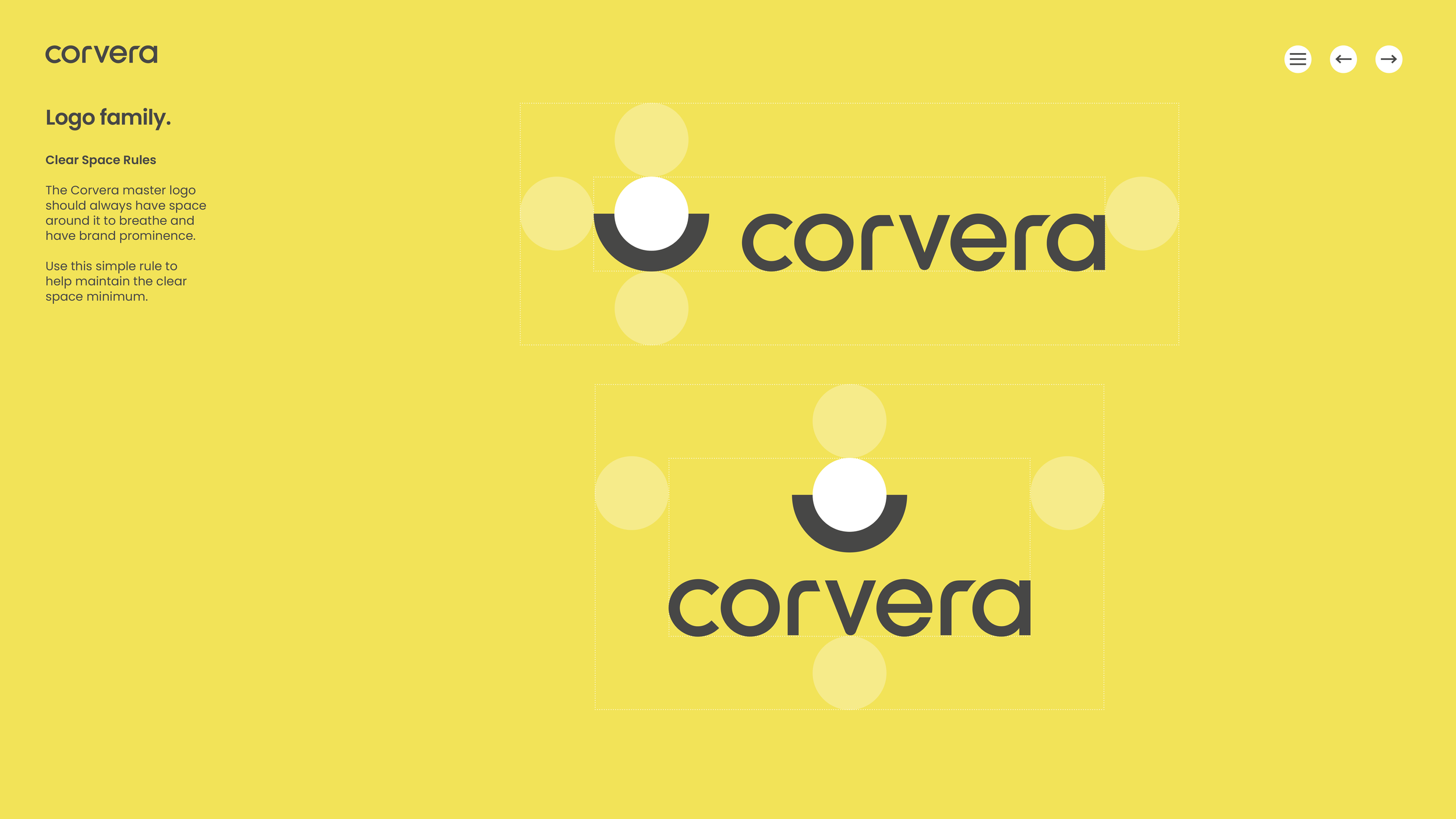
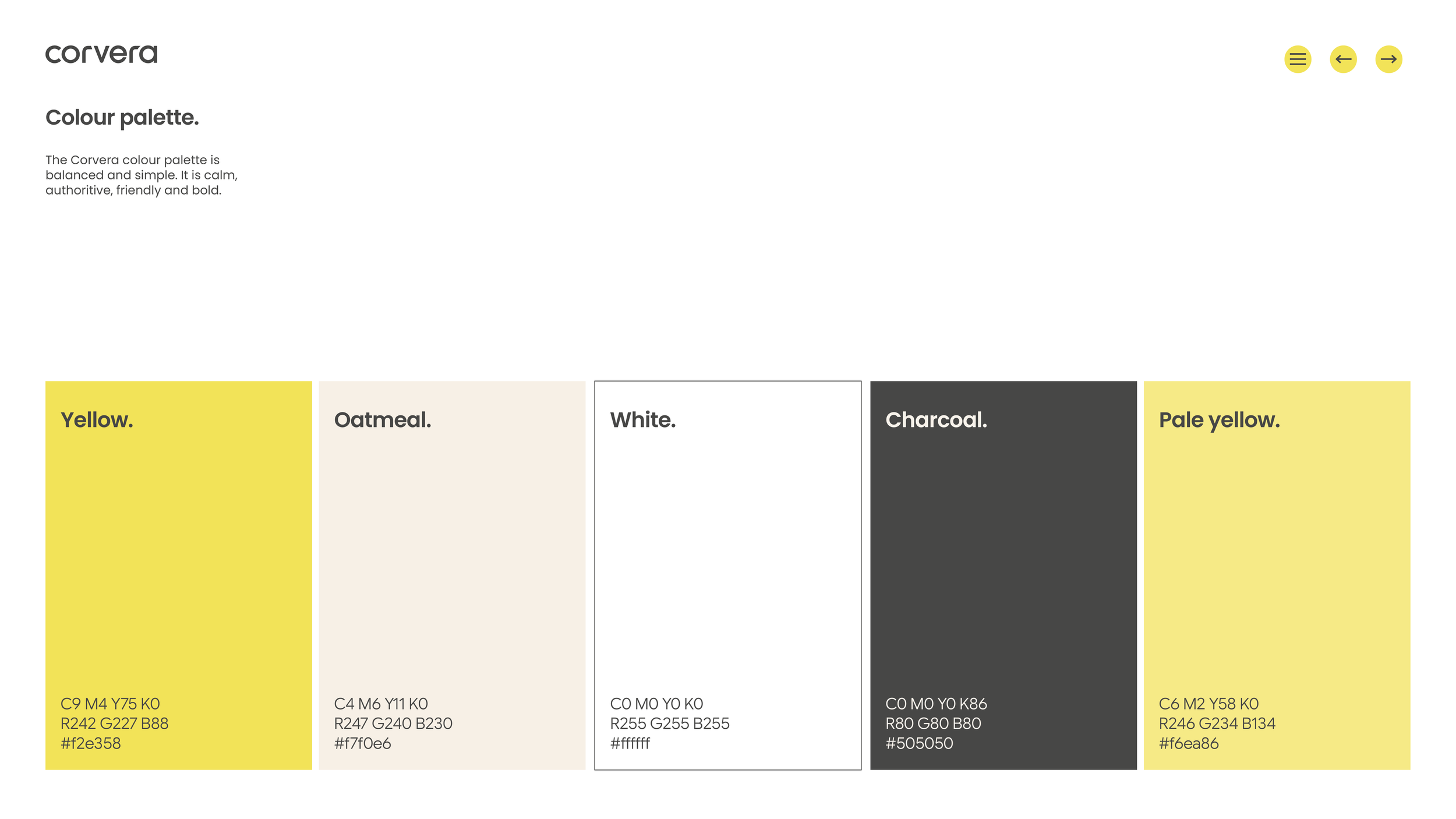
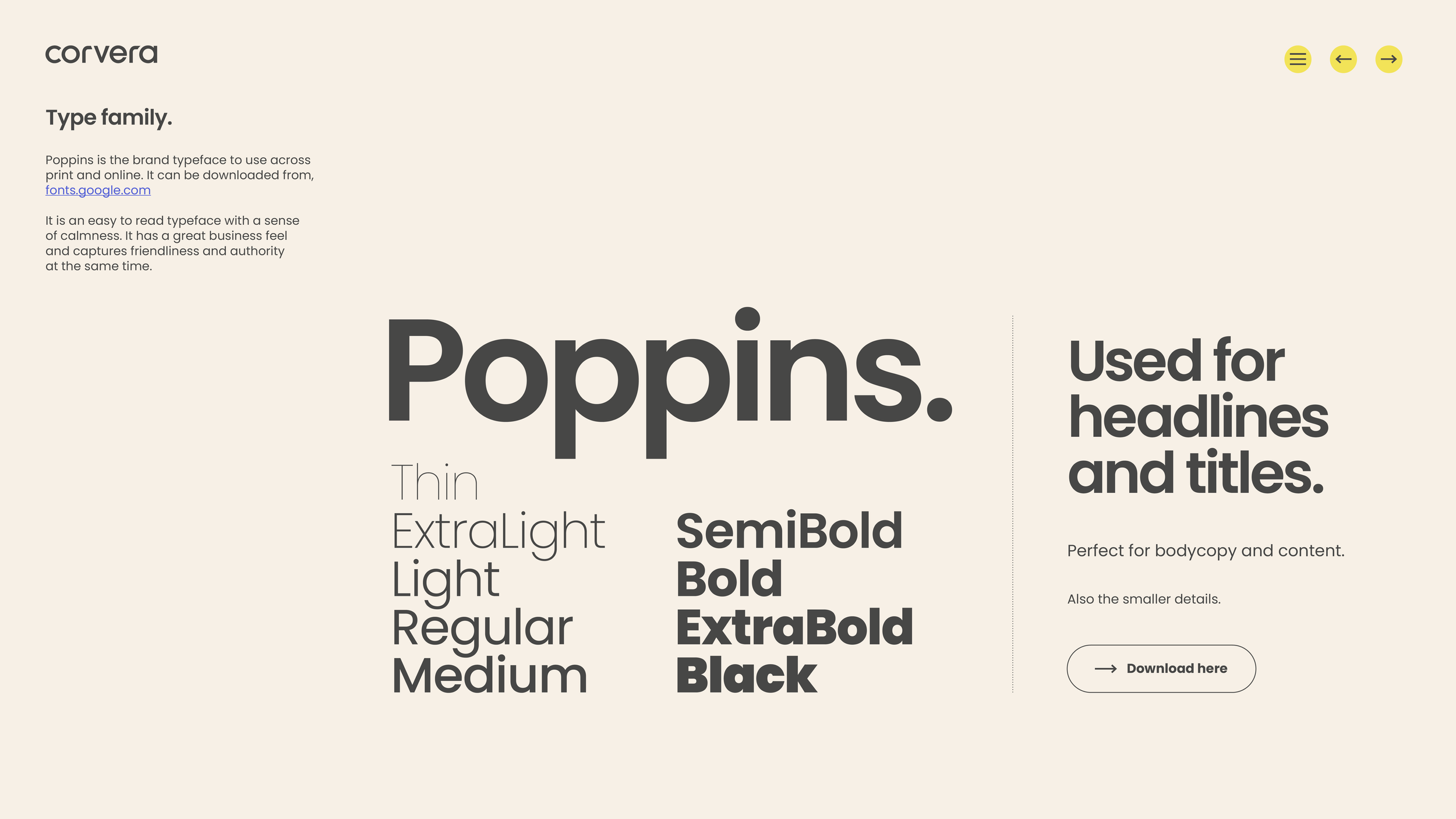
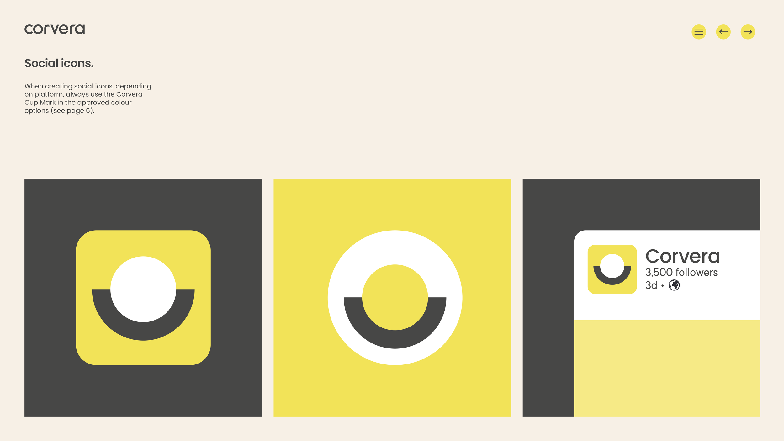
A glimpse inside the Corvera Brand Book.
Impact.
Defining a brand’s visual identity isn’t just about a new look and feel. To create an identity that is true to your brand, you need to interrogate the value proposition and even the product itself. The process deepens and tightens your pitch, particularly when you are at launch stage and are still refining your narrative for investors, partners, employees and customers.
“The team did a fantastic job bringing our brand to life. Their creativity and strategic thinking were amazing throughout the whole process. They produced an outcome that we are extremely happy with. I would highly recommend them!”
— Chris Kong. Founder, Corvera.